
Siesta Campers Logo Refresh
Siesta Campers - Siesta Campers, Portugal's #1 van rental company. Siesta Campers has built VW vans and explored life on the road for over 20 years.
Let’s Connect
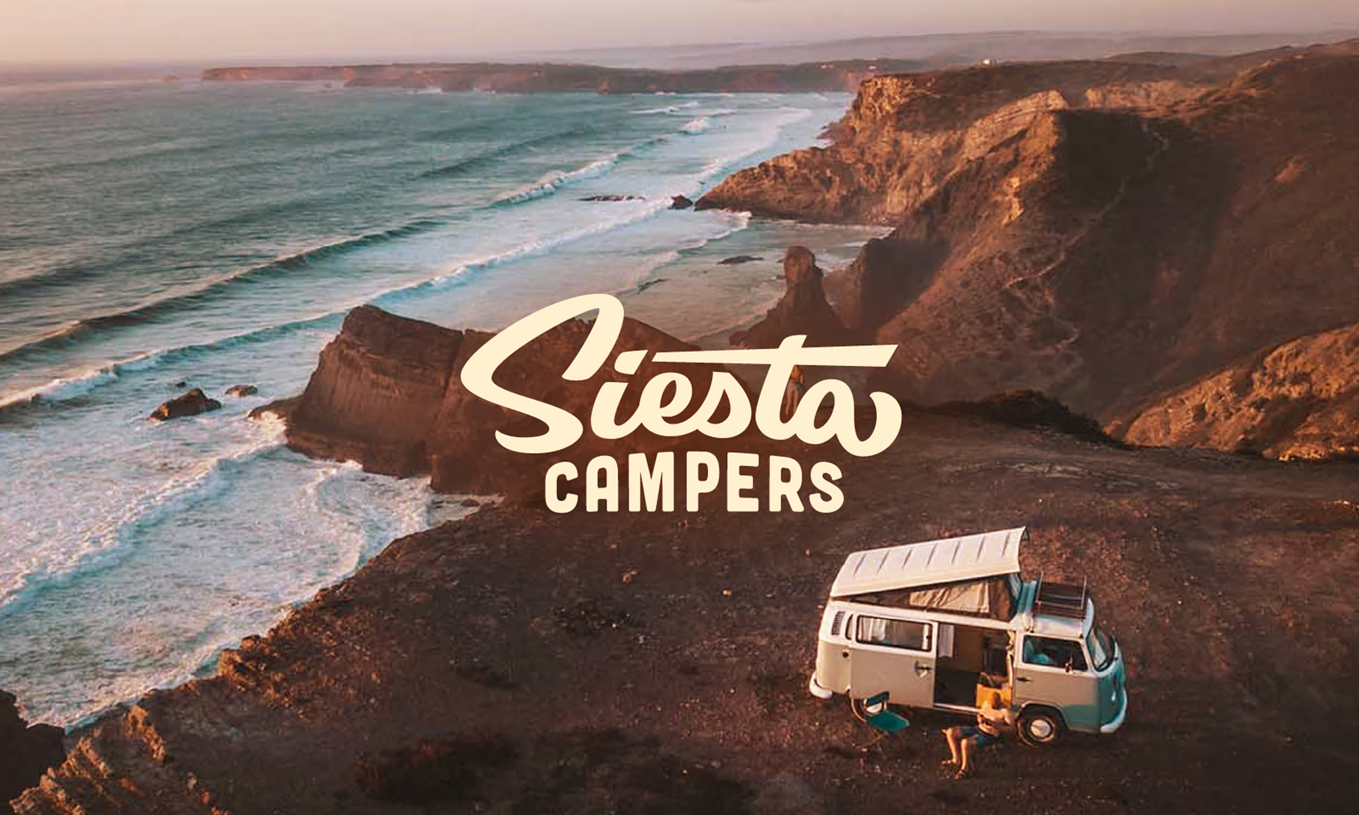
Siesta Campers is Portugal’s leading campervan rental company, known for transforming classic VW vans into vehicles built for coastal adventure and life on the open road. With more than 20 years of road-tested experience and a loyal community of explorers, Siesta Campers came to us ready to refine a logo system that better matched the evolving brand and its dynamic lifestyle ethos
Client
Siesta Campers
Services
Creative Direction
Logo Design
Animation
Year
April
2022
Links

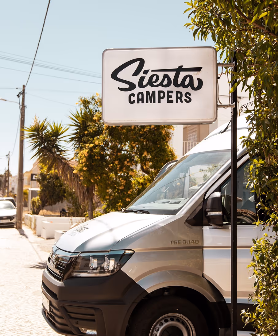
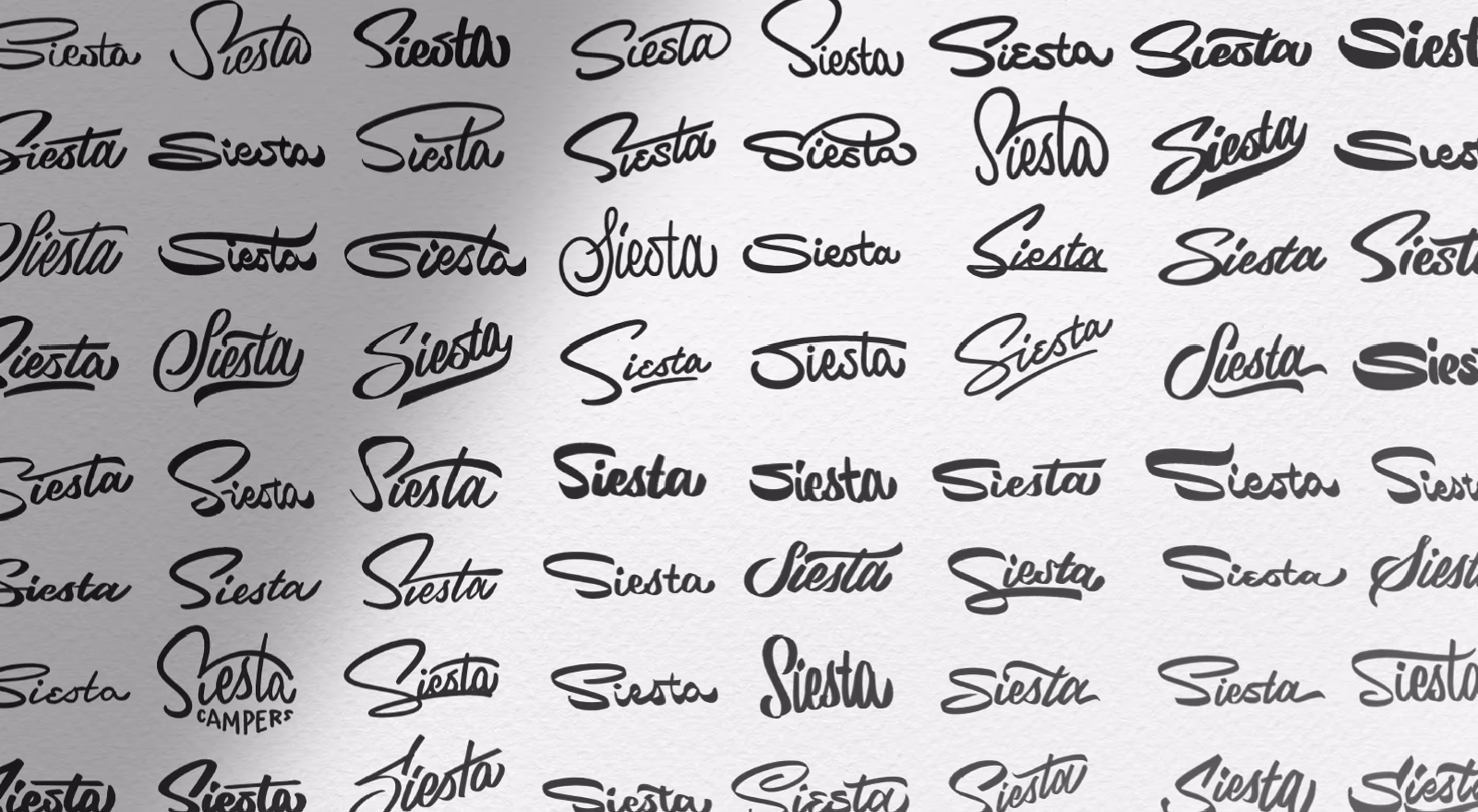
The heart of the identity is the “Siesta” wordmark: a free-flowing, surf-inflected script that evokes relaxed energy, travel, and the rhythm of life on the coast. Rather than abandoning this personality, we leaned into it, enhancing the motion and fluidity in the letterforms so the logo feels alive and kinetic
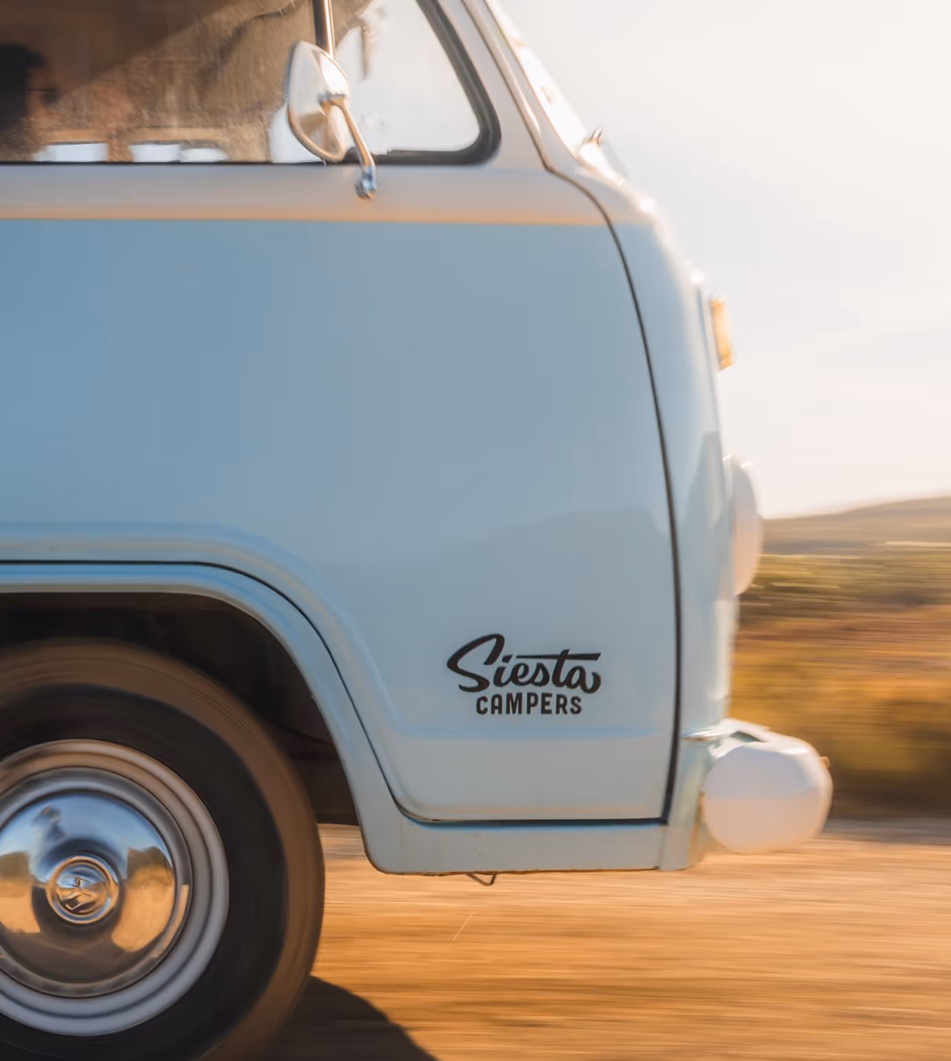
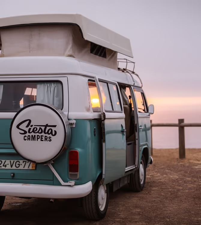
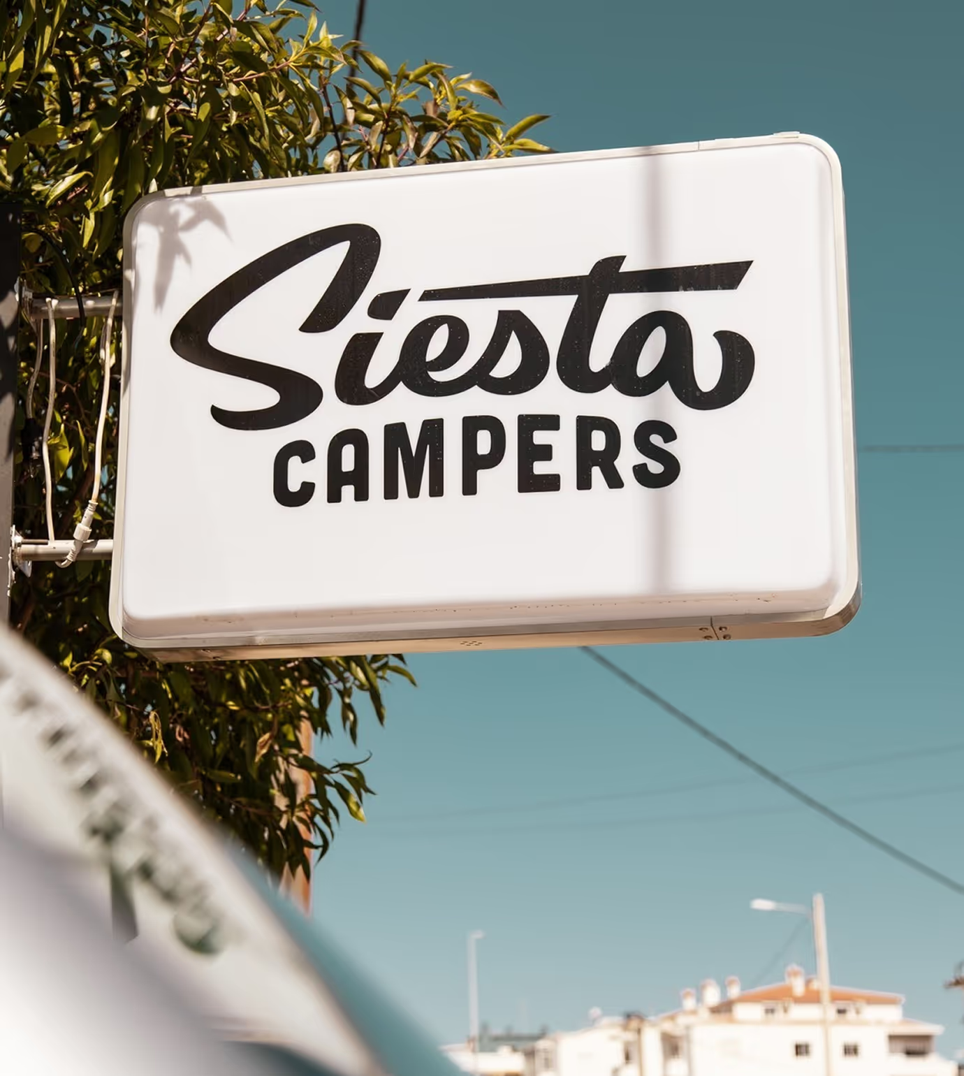
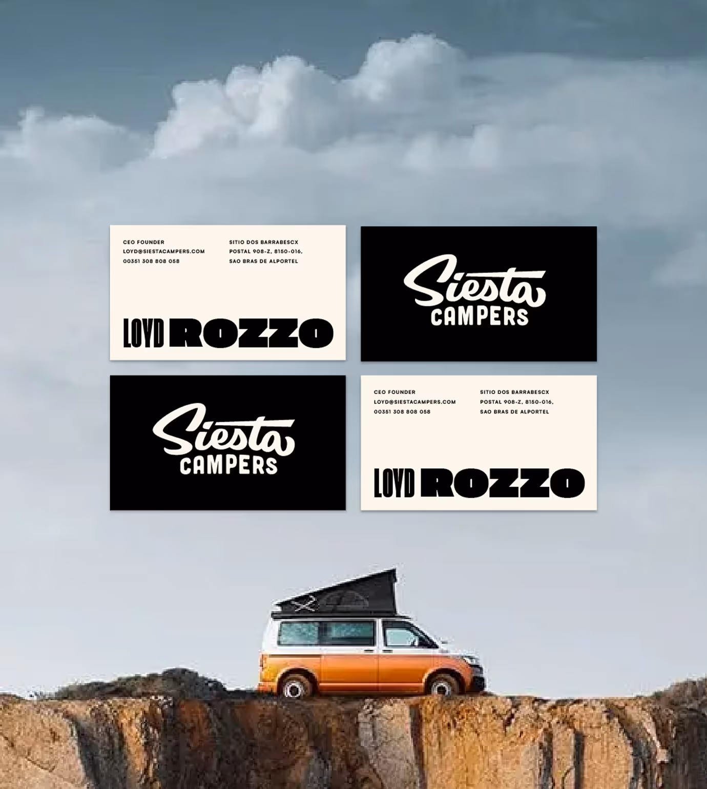
A modern identity must work everywhere, from vehicle decals to digital touch points. For Siesta Campers we delivered a flexible system lets the brand adapt to context without losing coherence.
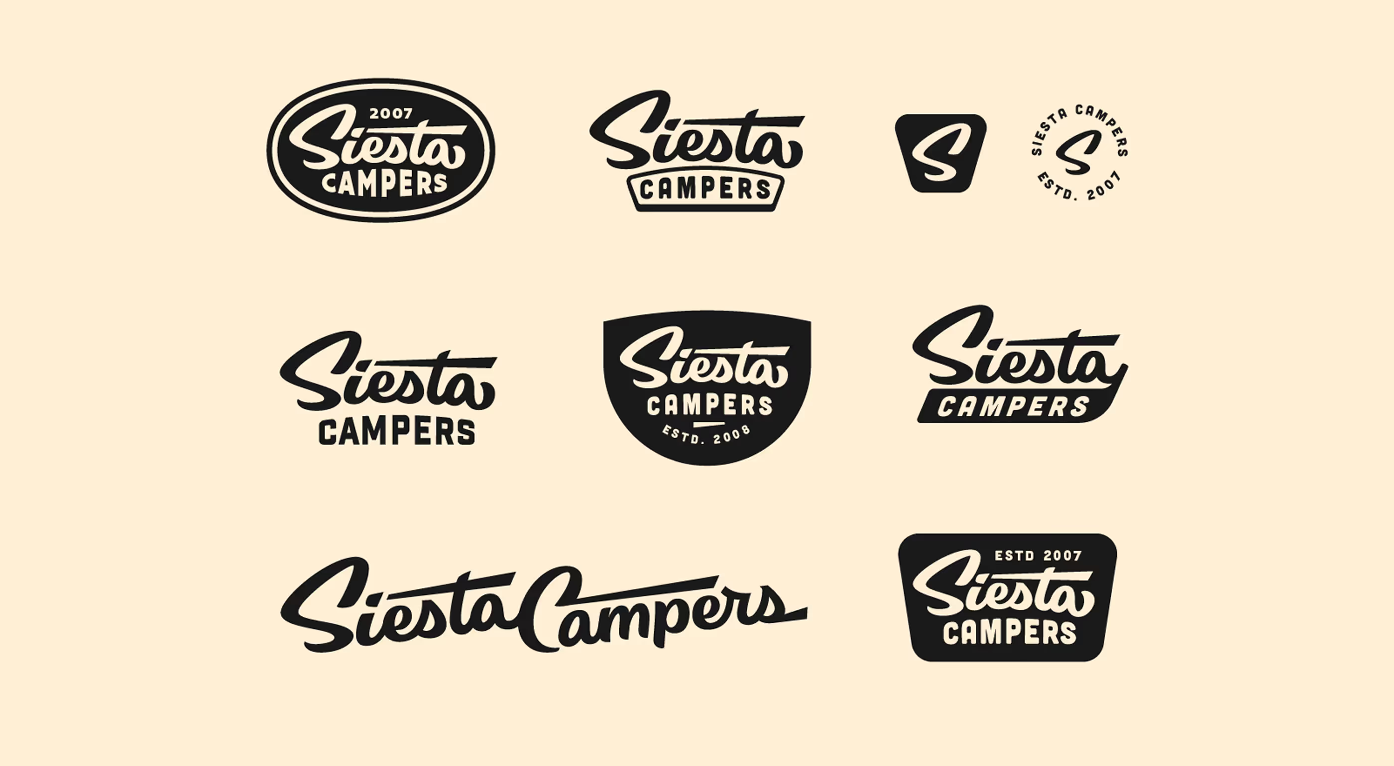
Refining for Legibility
The previous iteration of “Campers” had forms that created visual “bloat,” making it harder to read at smaller scales or on apparel and vehicle signage.
Responsive Logo System
With the addition of badge and emblem variations, this flexible system lets the brand adapt to context without losing coherence.


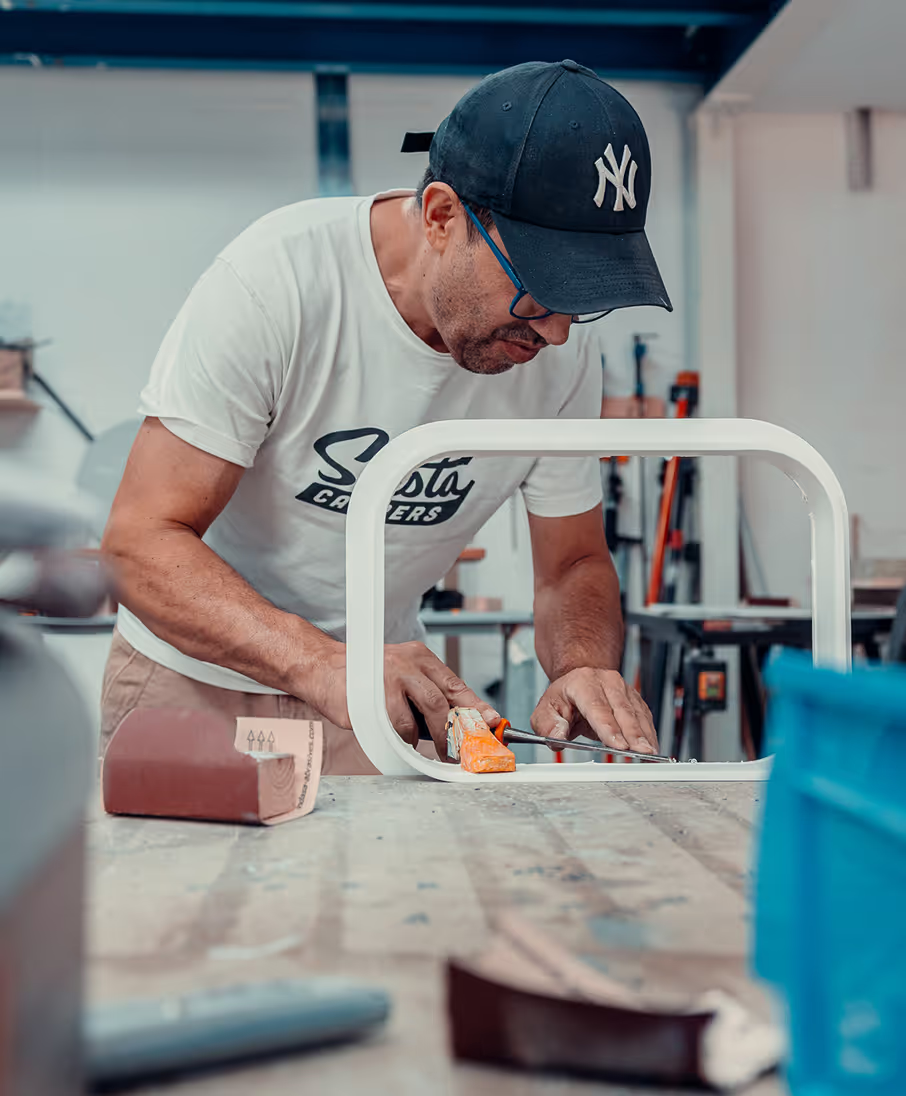
“We knew Wells was the right choice for our logo refresh. His typography skills are amazing. He worked through a comprehensive set of ideas that felt like a fluid transitional journey until we reached the final choice. The logo refresh sits perfectly with our company, and we all wear that logo daily with pride. Thanks for the journey Wells.”
Loyd Rozzo
Siesta Campers CEO / Founder